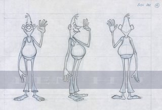
Here are the pose and turnaround sheets (with a fancy schmancy line added) for my Contrasting Characters assignment. My goal here was to make much more appealing, entertaining characters - with real distinct personality - without flattening out the characters too much. Whether I succeeded or not, well, you decide.


As always, I see quite a number of things to improve on, but I'm pretty happy with it and of all the assignments done this term, I'm probably proudest of this one.


No comments:
Post a Comment